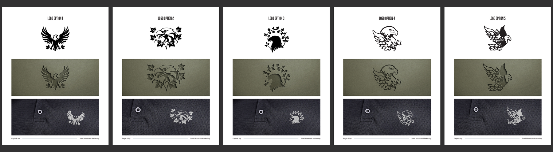
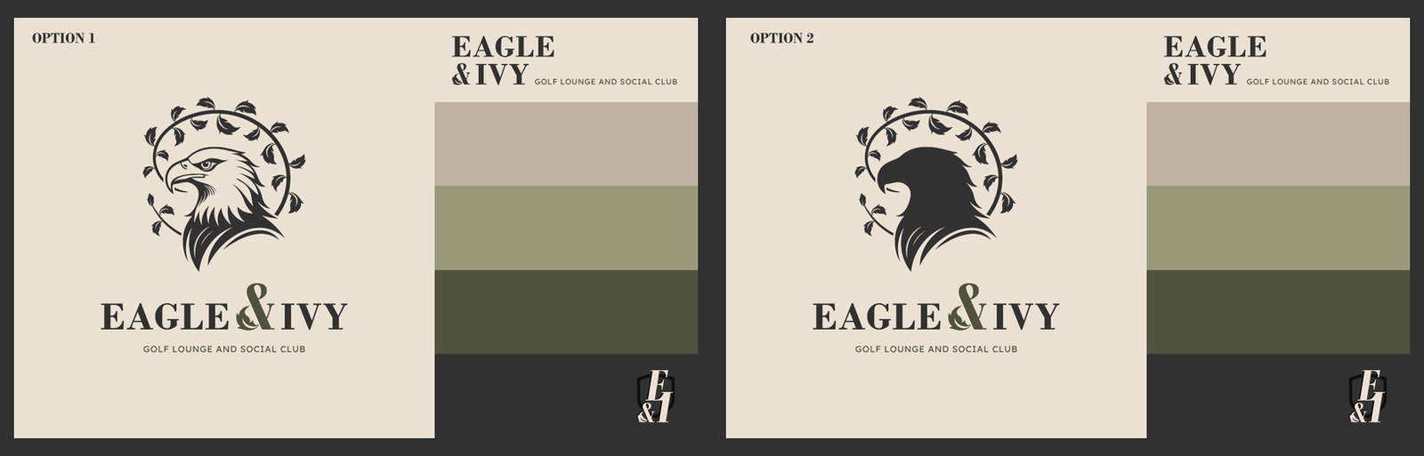
How Steel Mountain Marketing shaped Eagle & Ivy's identity from first sketch to final crest: a complete visual system spanning logo, color, typography, and a 14-page brand guide built for the real world.
Start Your Brand
The Brief
Eagle & Ivy had all the ingredients for a memorable hospitality brand. The name gave us a strong foundation, and the space brought together three distinct experiences: restaurant, bar, and golf lounge.
Our job was to bring those ideas together into one cohesive identity.
We wanted the brand to feel established, polished, and confident, while still being approachable enough to make people want to walk through the door.
The System — Brand Guide
A strong logo is only the beginning.
To help Eagle & Ivy maintain a consistent presence as the business grows, we developed a 14-page brand guide covering the essential pieces of the visual identity.
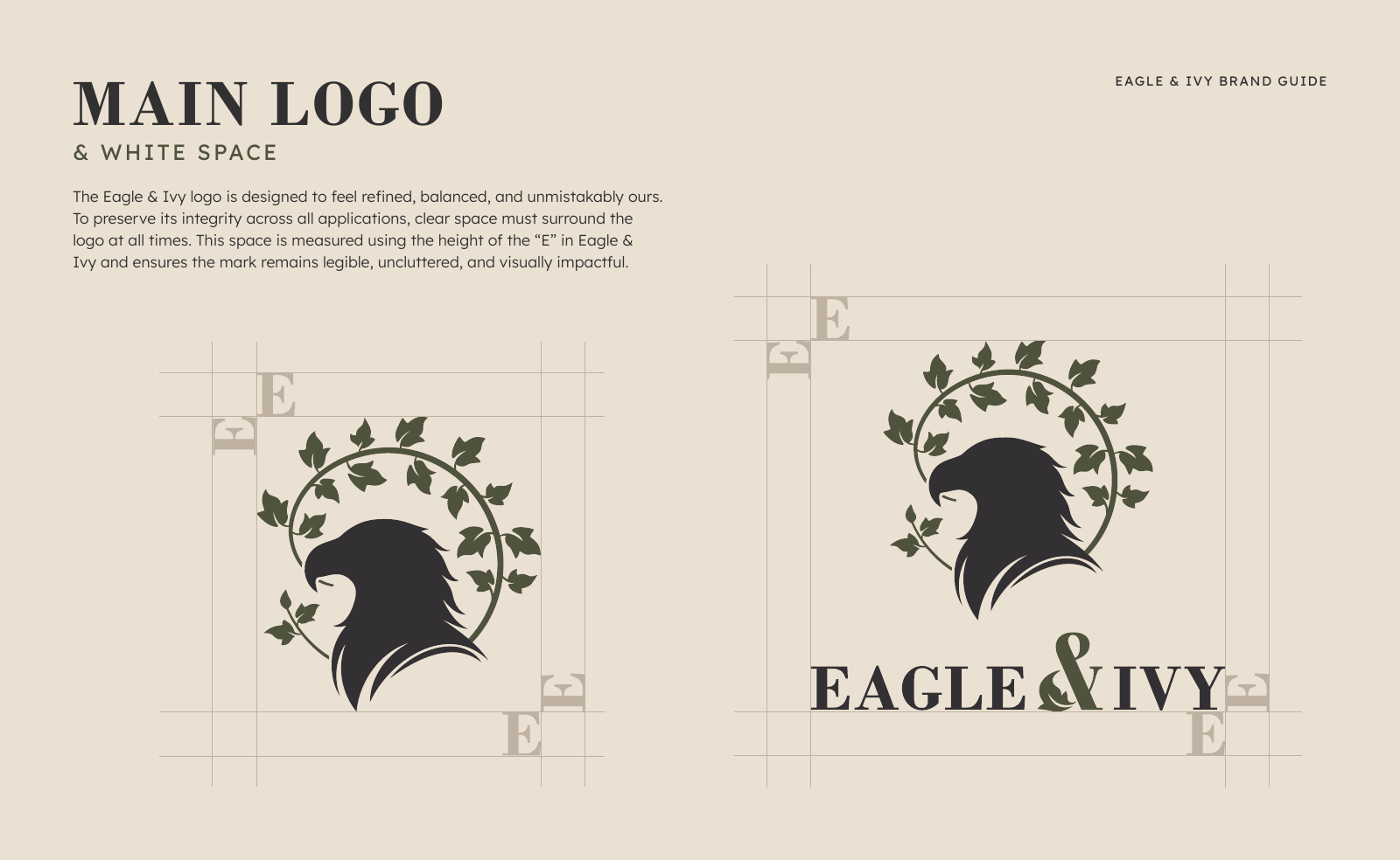
Logo & Clear Space
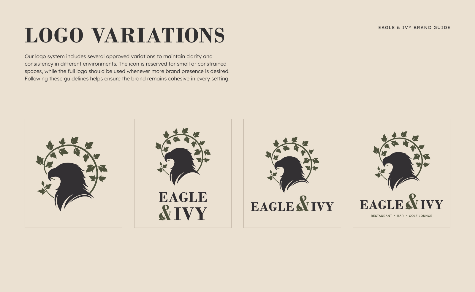
Logo Variations
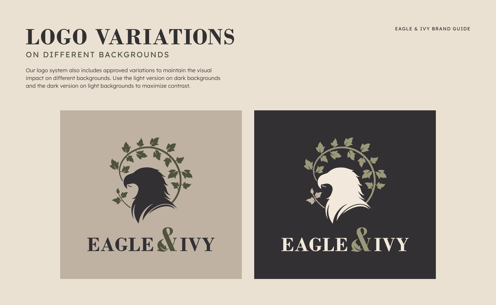
On Any Background
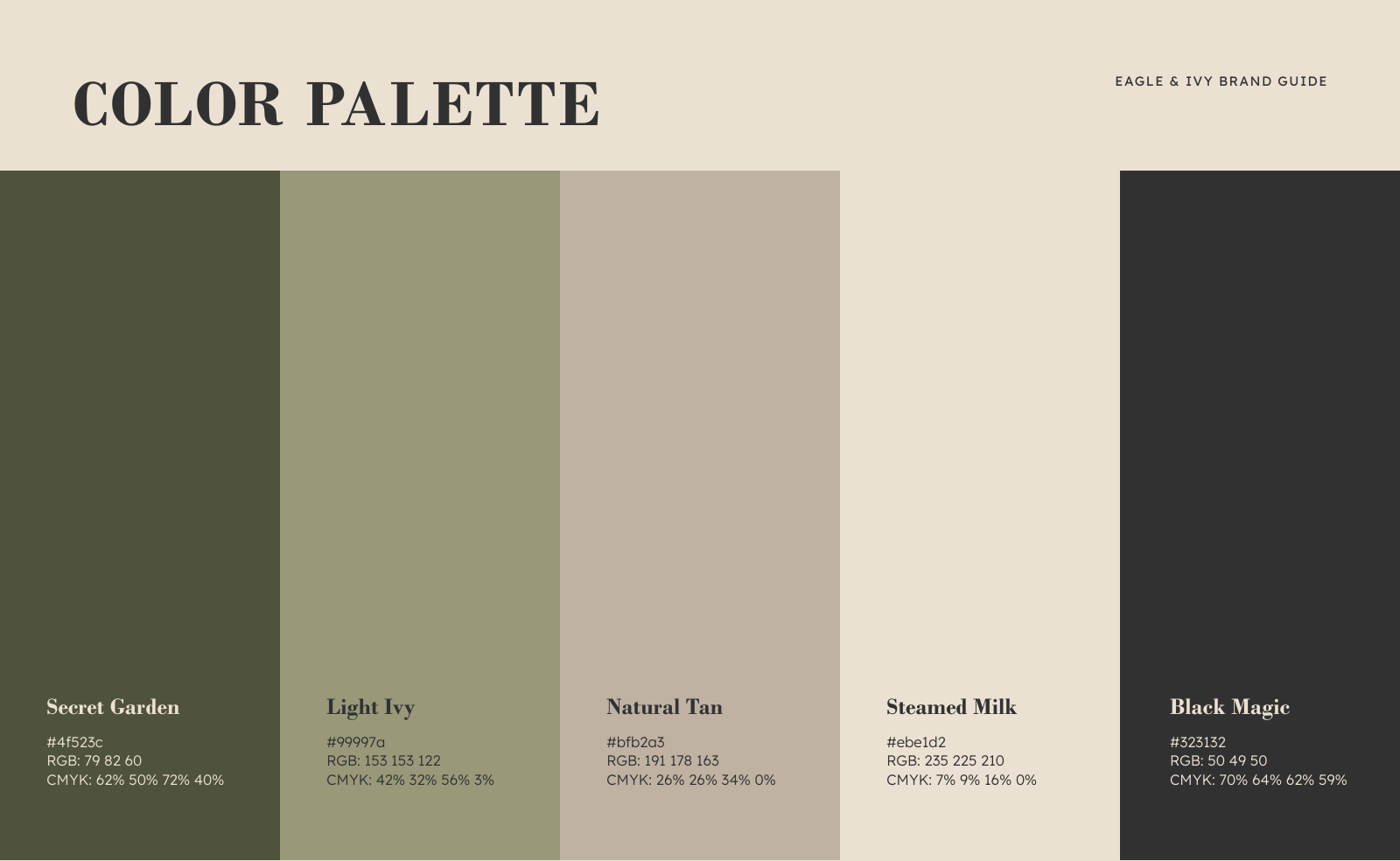
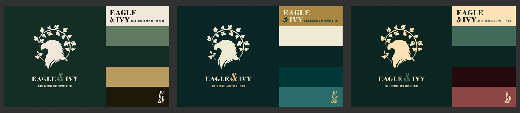
Color Palette
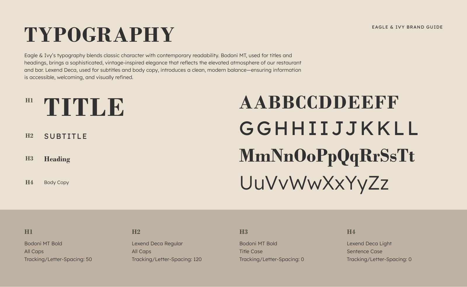
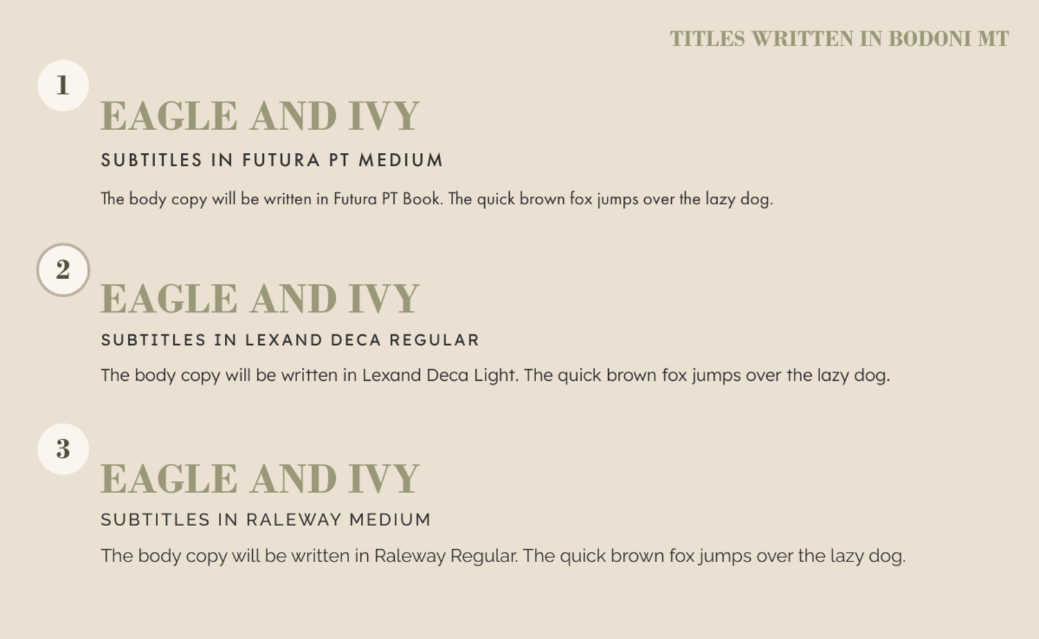
Typography
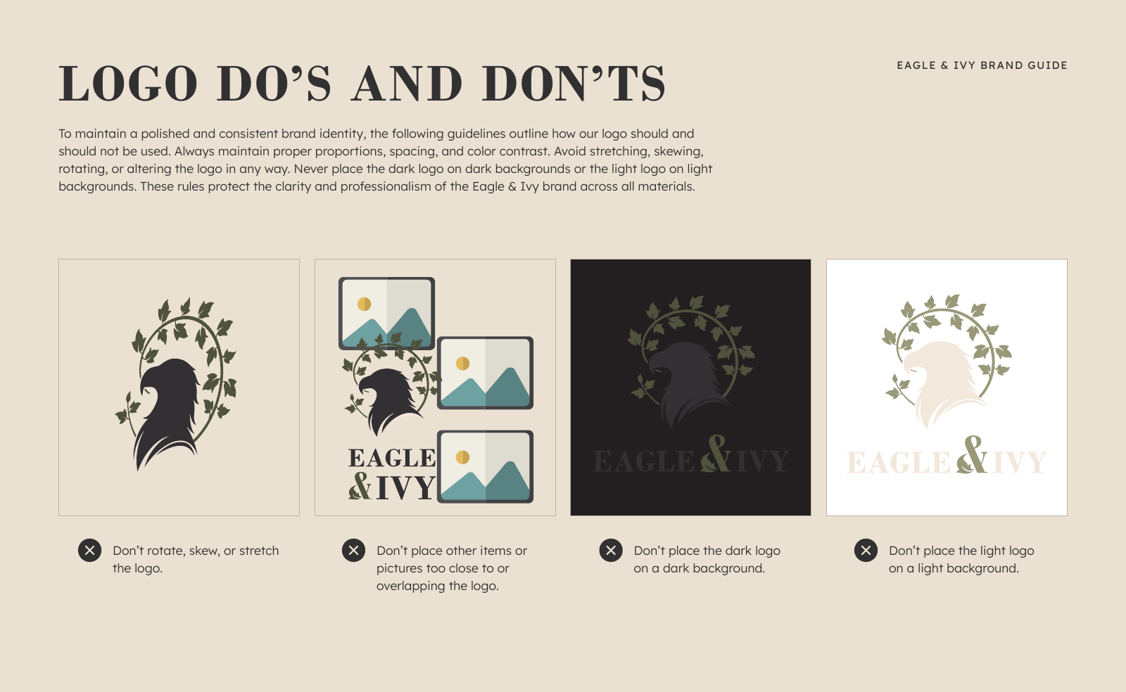
Do's & Don'ts
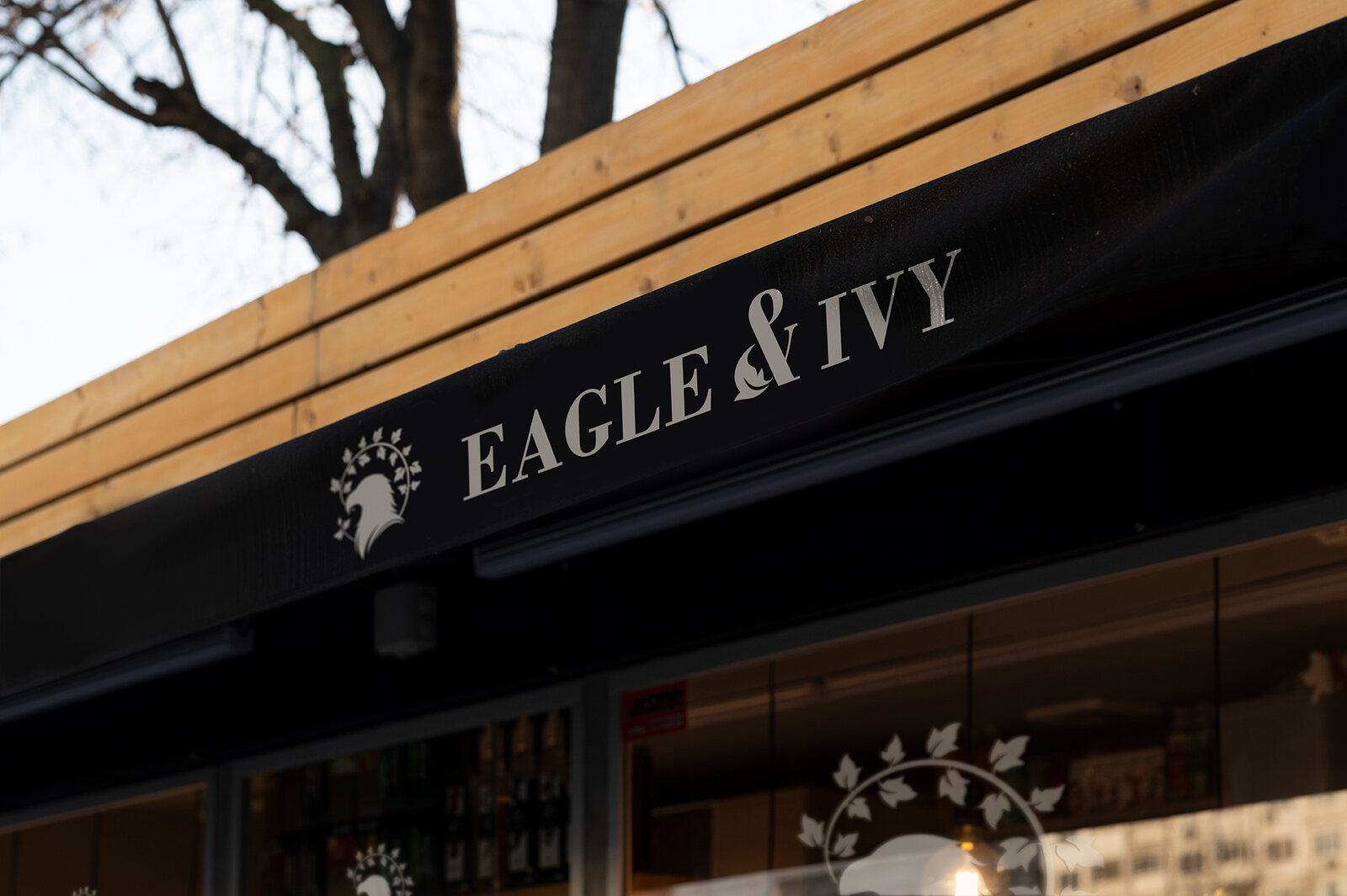
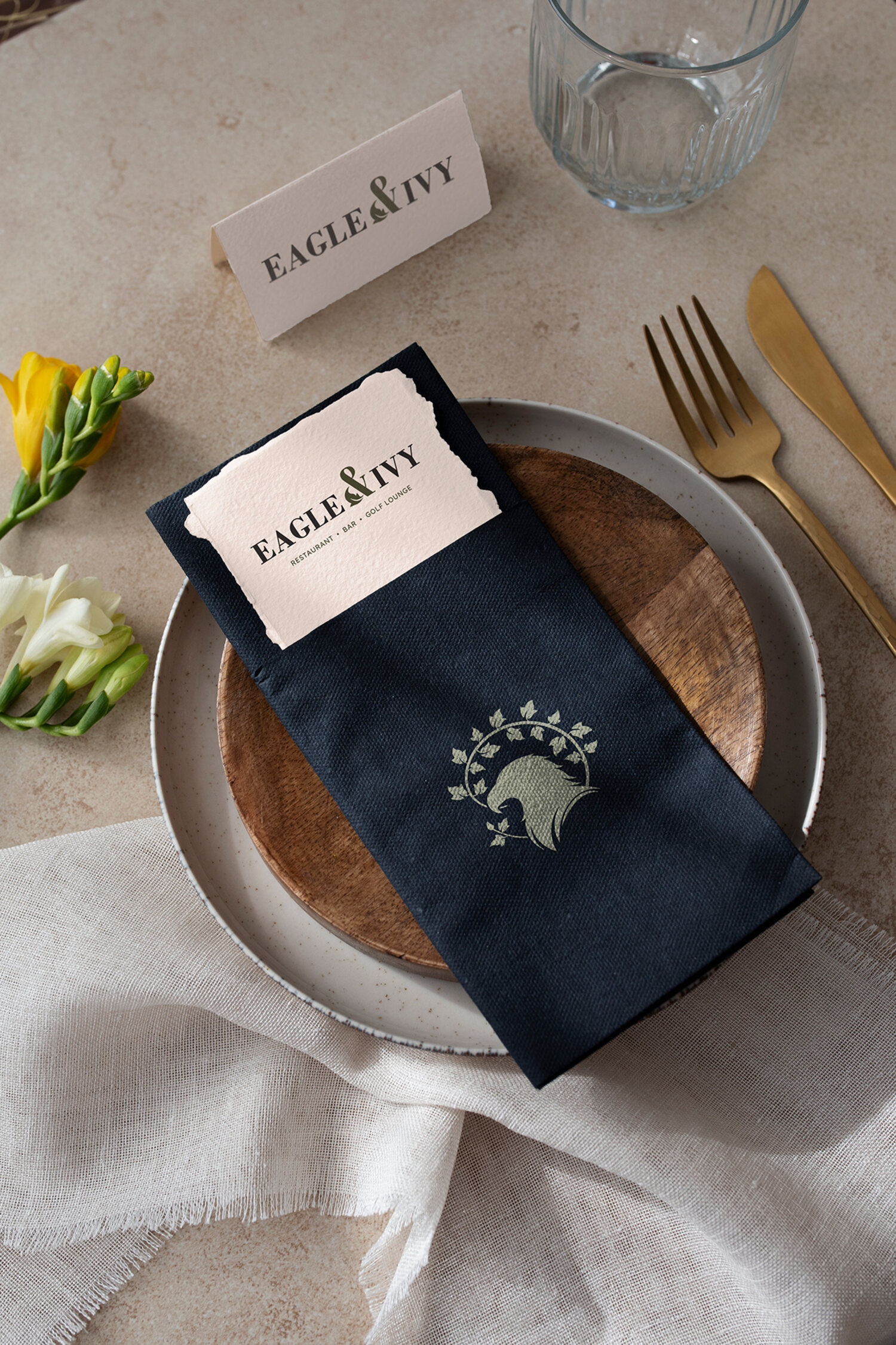
In the Wild
The real test of a brand is what happens after the logo leaves the screen.
From signage and menus to the smaller details throughout the venue, the Eagle & Ivy identity was designed to create a consistent experience wherever customers encounter it.
The result is a brand that feels polished, recognizable, and established from day one.
"Working with Steel Mountain Marketing was a great experience from start to finish. The team was responsive, easy to work with, and delivered exactly what we needed for Eagle & Ivy."
From first sketch to final crest, we build identities that make a brand-new venue feel like it has been the neighborhood favorite for years.